Orbitz was created to challenge the overly minimal, medicinal look dominating the wellness beverage space. I envisioned a brand that feels intelligent but joyful—balancing botanical ingredients and scientific integrity with whimsical storytelling and vibrant energy.
The identity system combines soft organic shapes, expressive typography, and celestial-inspired visuals to reflect both gut health and internal balance. Packaging, digital presence, and motion assets were designed to feel cohesive and immersive. Orbitz positions itself as both functional and emotionally resonant—wellness that feels alive.
My Process
1. Competitive Audit & Category Analysis
I began by analyzing wellness beverage brands to understand visual patterns dominating the market. Many competitors leaned into sterile minimalism and clinical cues. This research clarified my opportunity: to build a brand rooted in science but expressed through warmth, playfulness, and personality.
2. Audience Definition & Brand Positioning
I defined Orbitz’s audience as women seeking balance, vitality, and intuitive wellness. From there, I crafted a positioning statement that balanced credibility with emotional resonance. This stage established the brand’s tone — intelligent but whimsical, informed but never intimidating.
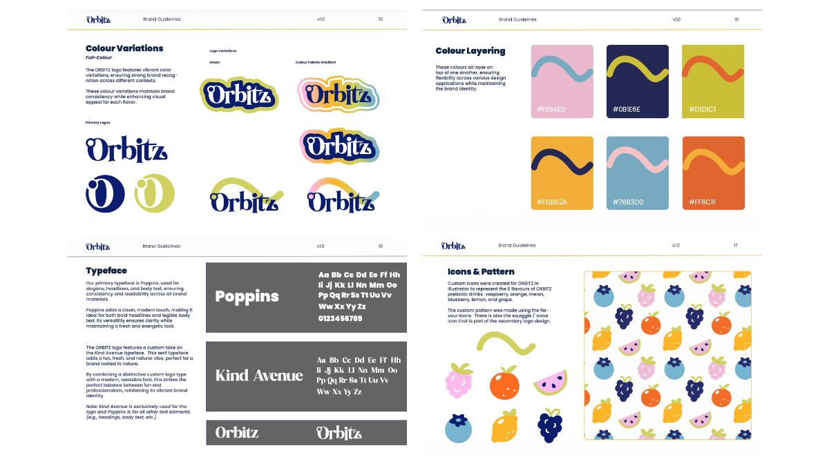
3. Visual World Building
Rather than starting with a logo, I built a visual universe. I explored celestial metaphors, organic shapes, fluid forms, and expressive typography to reflect inner balance and gut harmony. This ensured the logo became part of a larger, immersive system rather than a standalone mark.
4. Logo & Typography System Development
Multiple word mark and symbol explorations were tested for scalability and personality. I refined type pairings that felt scientific yet soft, avoiding anything overly rigid. The final system supports packaging, digital media, and motion without losing clarity.
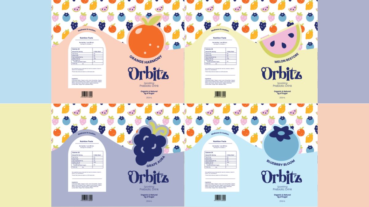
5. Packaging Design & Application
I designed labels and mock ups with hierarchy, ingredient storytelling, and shelf impact in mind. The packaging balances educational elements with visual delight, ensuring the functional aspects of the beverage remain clear without overwhelming the design.
6. Digital & Motion Extensions
To complete the brand world, I developed web and motion concepts that translated Orbitz’s personality into animation. Movement emphasized orbiting forms and flowing transitions, reinforcing the brand’s theme of internal balance and energy.
• Created a fully realized, portfolio-ready brand system
• Demonstrated ability to balance strategy with visual expression
• Developed cohesive packaging and digital brand applications
• Strengthened my ability to design within the wellness space without defaulting to cliche aesthetics
Orbitz demonstrates an end-to-end branding system built for a real-world wellness product. The project highlights my ability to translate strategy into cohesive visual language, balance emotional storytelling with functional clarity, and design across physical and digital touch points.
This case study showcases my approach to brand led design where concept, audience, and execution work together to create meaningful, market-ready experiences.
